The two Ontons
“The average shopper spends 79 days before making an online purchase. Onton’s mission is to reduce that decision time to zero.”
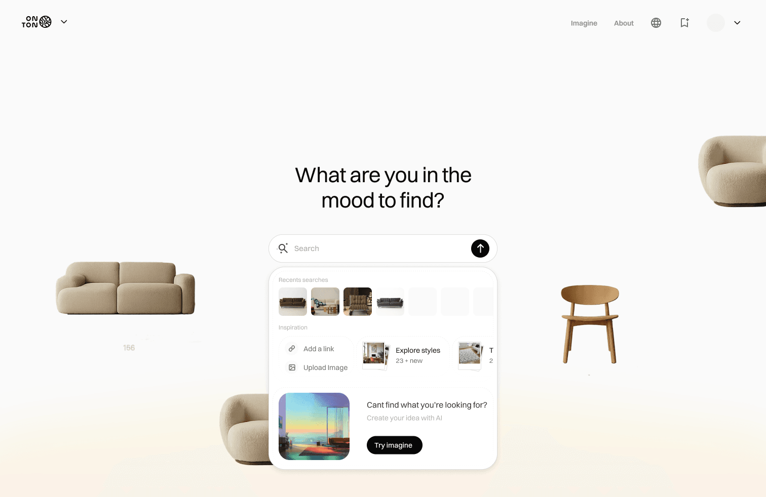
Before I joined, Onton had grown from 50,000 to over 2 million monthly visitors, and image generations were climbing. People weren’t just shopping; they were reimagining whole spaces. At the core is a personalized feed, Pinterest-like, that surfaces what each user will love. It served two audiences:
1
- Find a product
- Evaluate it
- Buy it
2
- Browse for ideas
- Reimagine a space
- Save for later
The problem
Discover’s panel behaved like a storefront, with price and promos on every card, pushing explorers to evaluate before they’d finished imagining. And exploration didn’t flow: moving between the feed, a product page, and Onton’s other tools kept dropping people back into shopping.
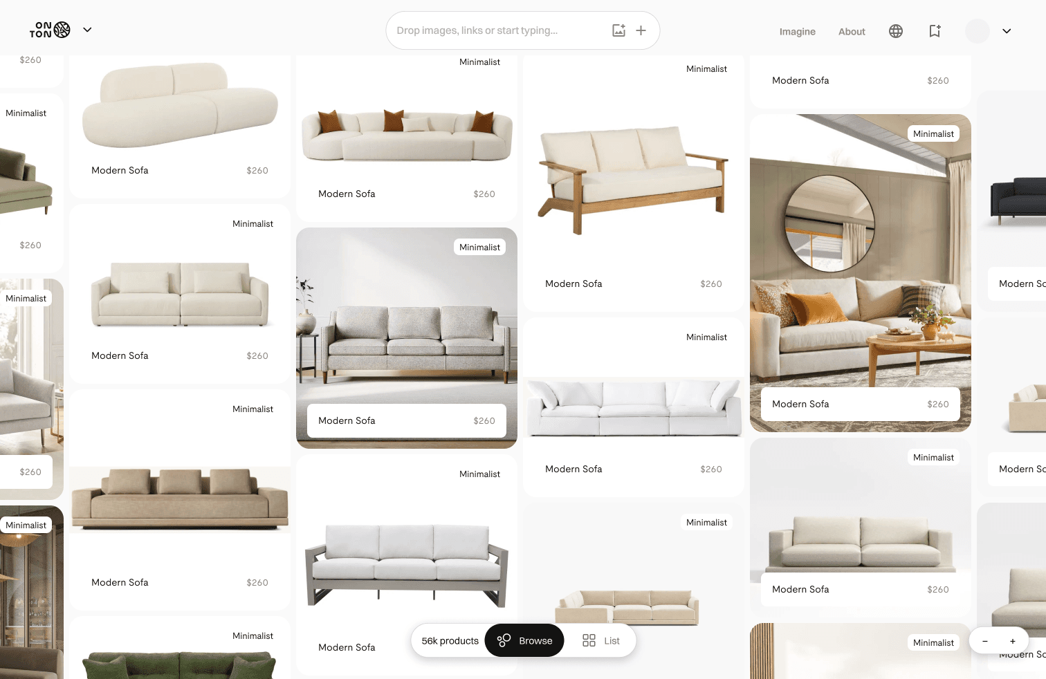
How might we let people explore freely while still finding their way to buy?
The redesign
I treated Discover as a system, not a screen. Three moves:
1. Let the personalized feed lead
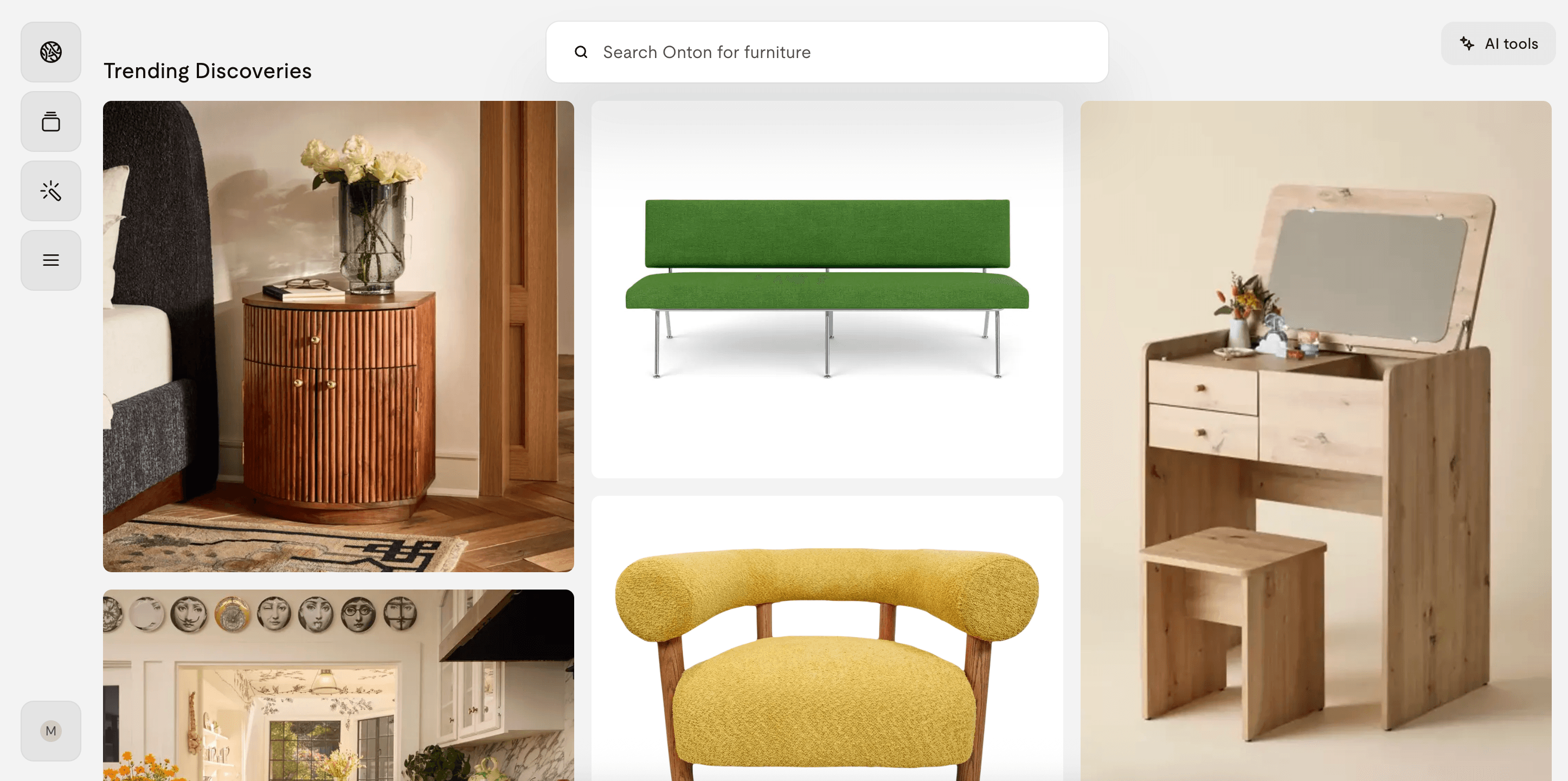
The feed is personalized, so I designed for an output I couldn’t predict: a flexible, image-first grid that holds up whatever the algorithm returns, with price and promo stripped out so picks read as inspiration, not inventory.
2. Kept exploration moving
A product page used to be a dead end. I added a “More like this” button that opens a fresh feed seeded from that item, so evaluating one product starts the next hunt instead of ending it.
3. Connected Discover to Onton’s tools
Drag any image off the feed straight into the image tool, to reimagine a space around it, or the gather panel, to collect it. Discovery feeds creation, by hand.
- 1.
The personalized feed: image-first, no prices.
- 2.
Tap a product to open its page.
- 3.
“More like this” opens a fresh feed seeded from that item.
- 4.
Drag any image into the image tool or gather panel.
Impact
One surface now serves both routes. Buyers keep a clear path to purchase, and explorers get room to browse without pressure.
What the redesign was built to move
- More time spent exploring the feed before drop-off.
- More products saved to the gather panel and carried into the image tool.
- Deeper engagement with the exploratory route the company was investing in.