The problem: snacking isn’t considered aesthetic
This started because I was drinking a Poppi and thought, this is such a well packaged drink. Why does it feel like beverages are more intentionally designed than snacks? This can’t be a coincidence.
I hypothesized that maybe it’s because there is more of a beverage culture than there is a snacking culture. Some drinks — nicely packaged ones — can be used as an accessory by a trend-forward consumer, where snacks typically aren’t, as they aren’t packaged nicely.
Plus, today’s diet culture is shaping how many young people view snacking — turning between-meal eating into a moralized act. This has fueled a multi-billion dollar market for “guilt-free,” low-calorie, or macro-focused diet snacks. Hence, these brands almost always make their healthiness the forefront of their packaging as well.
We don’t go around eating a lunch wrap that is covered in its calorie content. Why was snacking reflected through its packaging as something that has to be explained? This case study attempts to question whether snack packages can work to change the way many view snacking — creating an in between for those who value health as a personal matter.
My initial visualizations
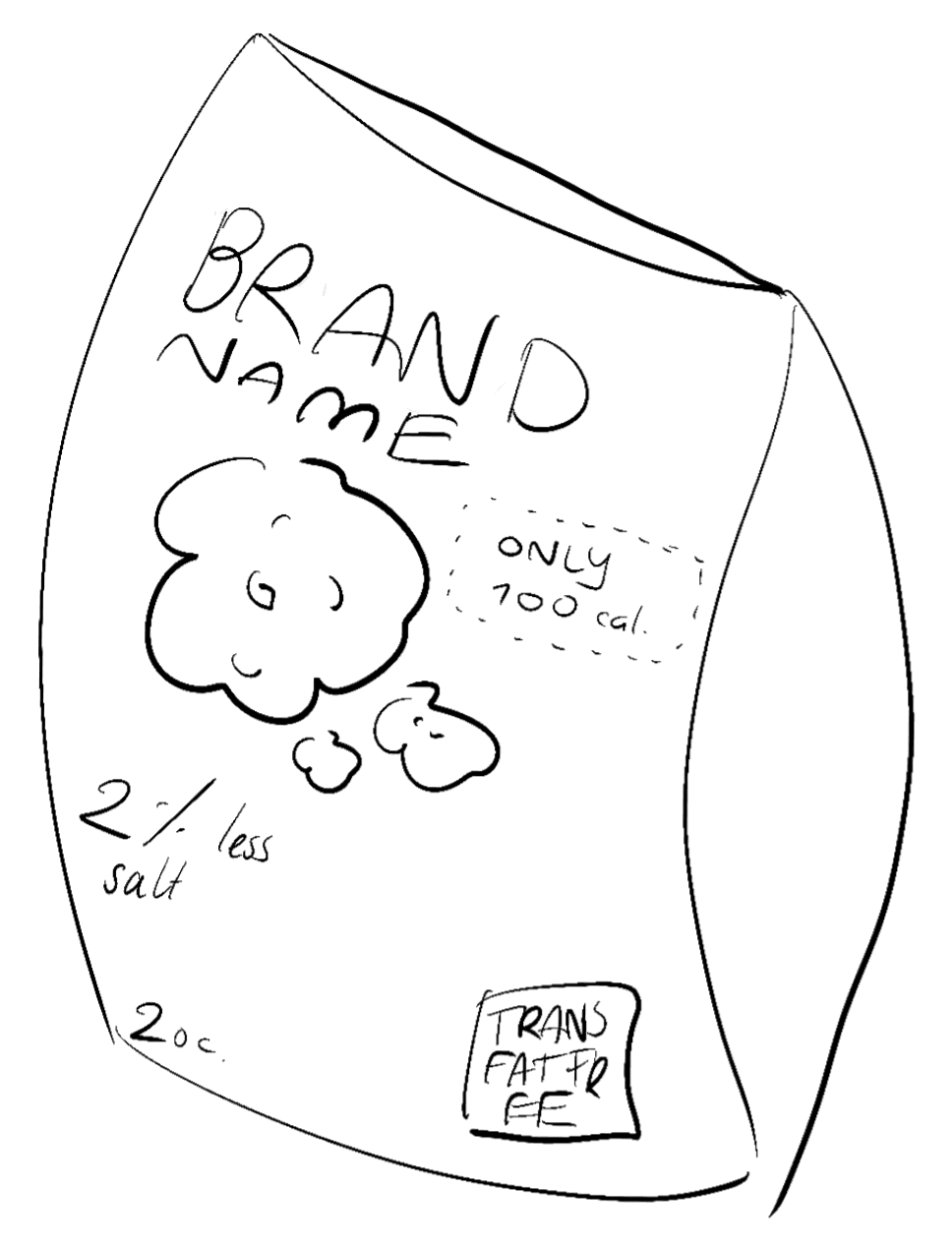
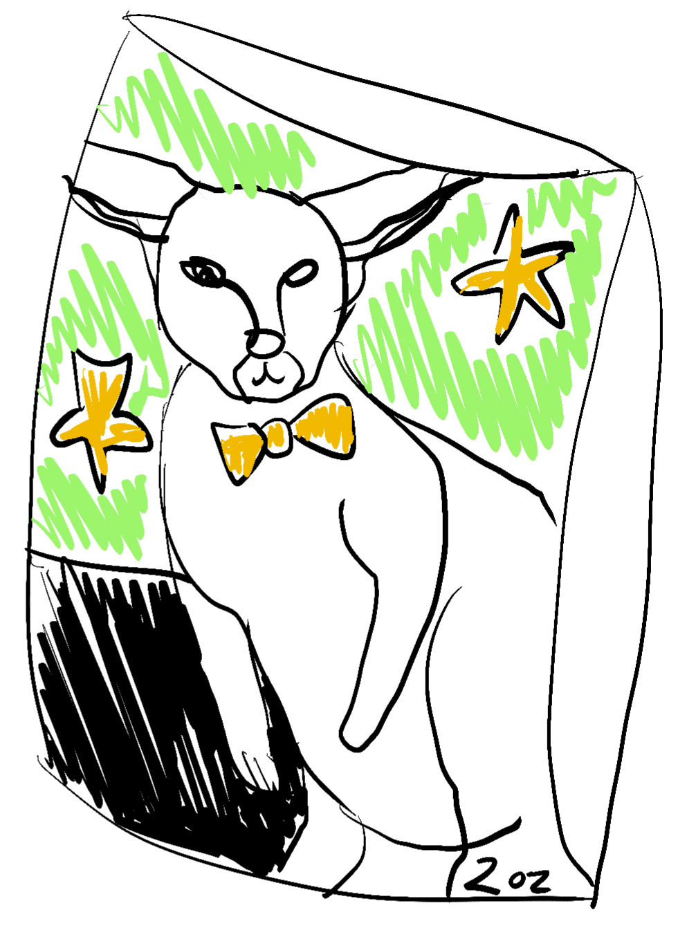
Rough sketches to showcase my idea.
Standard snack packaging
The Crunch redesign
Front
Back
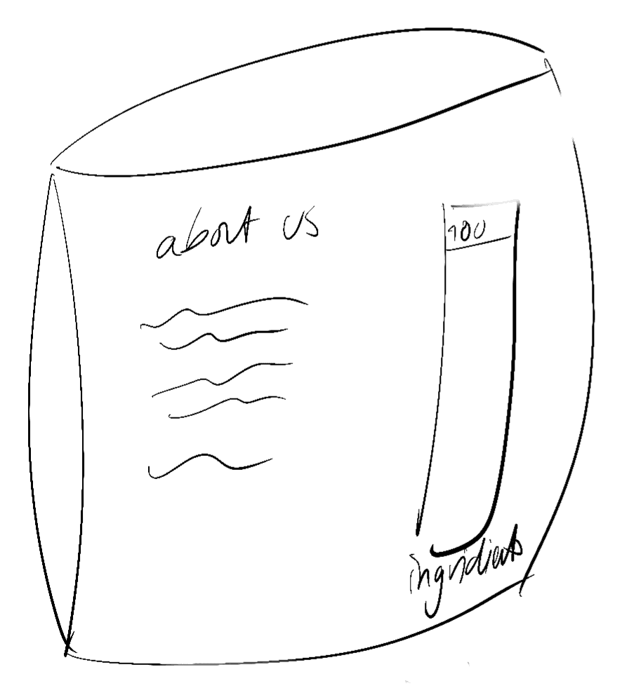
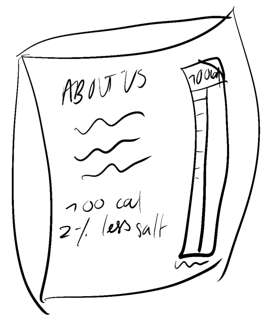
Laid side by side, the drawings highlight the redundancy in the information on standard snack packaging — the calories, the salt, the badges, all stated twice.
Moving everything to the back doesn’t actually reduce the information a customer gets. It makes it more intentionally consumed, and more personal. And it leaves room for the front of the package to convey a mood through expressive graphics and symbols.
The lineup
I thought of my four favorite snack flavors:
- Fiery Chilli Lime Rolled Tortilla Chips
- Cheddar + Sour Cream Crinkle Cut Chips
- Southern BBQ Kettle Baked Chips — designed end to end
- Cheese and Pepper Puffed Corn and Rice Snack
I built a system that works for creating packaging for any flavor, but took Southern BBQ all the way through as my example for this study.
What people actually do
I ran interviews with people in my college to find out whether the feeling was mine alone, or a shared behavior around snack eating culture.
- 80% said they often felt apprehension towards eating packaged snacks (chips, popcorn, pretzels, crackers) in public.
- 70% said no to usually reading the information on the back of the snack package.
- Over 60% agreed that all the important information is already displayed on the front — which is why they never turn the package over.
Then I ran one more test. I handed participants a snack package (a random unpopular chip brand) with all the information scribbled off of the front. All participants immediately turned to read the backside of the snack.
Finding 1
The information wasn’t unwanted. It was just never wanted first.
The principle
Finding 2
Information should only be important if you want it to be important.
So all of Crunch’s information lives on the backside of the package — type of snack, ingredients, caloric contents. The front doesn’t conform to traditional snack packaging rules; it only displays necessary information, keeping the focus on the illustration and the aesthetic.
Instead of the traditional approach, which uses bold text to highlight calories and other nutritional information, the front uses illustration to communicate the contents of the snack. Using playful, graphic and eye-catching designs, Crunch aims to stand out — a gem on a shelf full of dull-packaged snacks.
The packaging works to make snacking fun, intuitive, and personal.
The system
Each snack package is broken down into four mandatory features:
- A representative animal
- The animal is doing or wearing a certain thing
- A blocked two-color background
- A theme-related pattern on the back side
The four features are the rules, so any flavor can be generated from them. To come up with each design, I began thinking of the associations — things, colors, textures — I have with each snack or the flavors involved.
Southern BBQ
Cheddar + Sour Cream
Fiery Chilli Lime Rolled Tortilla
Cheese and Pepper Puffed Corn and Rice
Southern BBQ is the flavor I took all the way through. Below is the system applied end to end to one package.
The logo
The name ‘crunch’ is derived from the textural experience of eating a snack — and the sound of the bag crunching when it’s opened, and eventually crumpled up and thrown out. The name is very much reflective of the experience.
I also designed a small mark to go along with the name: a simple corn kernel, referencing the core ingredient of each snack.
I played around with a few audacious slab serif fonts that each featured a tight-but-not-touching spacing, and landed on two finalists: Gigantic by Dave Rowland and 8 by Giulio Galli. I went with Gigantic. It had more edible associations to me — it reminded me of the Tony’s Chocolonely logo, which is very retro and bold.
I also decided to distort the shape of the text by arching it — this helped add to the playfulness of the brand. I ended up pushing the arch further so it followed the top curve of the kernel shape. On the back of the package, I wanted the ‘about our brand’ section contained inside the kernel, with the logo bending around it.
The illustrations
After finalizing the sketch, I came up with two versions of the illustration with different color palettes, and designed the back of the package — a key part of the product.
The illustrations use perspective to create an expressive graphic. The animal character is drawn very big, taking up more room on the package than it realistically should. For the Southern BBQ chips I chose a pelican, an animal found in the south. Drawn in this exaggerated style, the bird already has a personality before you’ve added anything to it. And then on top of that, I gave it cowboy boots — another feature key to the south. The boots extend off the front of the package onto the backside, which adds another fun element to the packaging.
The pattern
For the fourth rule — a theme-related pattern on the back — I created a desert-inspired floral pattern with a hand-drawn feel. It first appears on the front, on the boots, and is then translated to fall subtly across the background of the back of the package.
That’s the second thing carrying across the fold. The boots physically extend from front to back, and the pattern on them reappears behind the copy — so the two sides read as one object instead of a front you look at and a back you read.
Color
I kept each palette to no more than four colors, one of them a light neutral shade close to white.
For Southern BBQ I picked a palette that reflected a more warm, earthy, and desert-inspired feel. By combining muted natural tones with a few brighter accents, I chose a palette that was grounded but still had an energetic feel to it that reflected the imagery.
The four-color cap is what keeps the two-color blocked background reading as blocked, and it’s the rule that would hold the range together on a shelf — same structure, different palette, one family.
The campaign: “It doesn’t just look better”
Having spent some time in New York this past summer, I spent hours each day taking the train and staring up at the advertisements. It was easy for me to notice which ones were actually captivating, which advertisements I actually remembered. I think that was the most important feature of an advertisement in a setting like the train: being memorable. So that was the goal — creating intrigue through some sort of cliffhanger in order to create a memorable transit advertisement.
I started thinking about minimalist advertising, specifically Glossier, a brand I associate deeply with New York City.
Then I started thinking about catch phrases for the minimalistic billboard I was designing. I thought of this one:
“It doesn’t just look better”
To me, the rest of the sentence seemed obvious — it was implied somehow automatically, although I didn’t have proof yet. I finished up the mockup draft of the billboard and showed my mom. I asked her what the second half of the catchphrase would be, and she answered:
“…it tastes better!”
Exactly correct. She was able to immediately finish the sentence, so the second half was implied and did not need to be written.
Why it works
Then I started thinking about all the advertisements I see around cities like New York, and how the most effective ones somehow seem to be leaving something out. Whether that’s information, the rest of a sentence, part of an image. So there must be some sort of psychological explanation to why this works.
I found the Zeigarnik effect, a psychological phenomenon used in marketing today. It argues that our brains remember unfinished tasks better than completed ones, because when something’s unfinished, our brain can’t file it away — it stays at the back of your mind. This is exactly what a good ad should do: stay in the back of people’s minds until they are in the right environment to purchase the advertised product.
Marketers use this constantly. A half-told story, an incomplete image, a cliffhanger in an advertisement — none of it lets your brain settle until you see how it ends. And when attention is as scarce as it is now, that’s the whole game.
Sitting on the train is another example of where companies target new potential customers, flooding them with advertisements on each side of the train, on the walls of each stop and on billboards coming out of the station. These are micromoments, just like when you scroll past an ad — rushed and fleeting. In a sense, when we sit on that train, each ad is competing for our attention. And the ad that wins isn’t necessarily the one we spend the most time looking at. It’s the one that’s most successfully recalled.
That’s what the catchphrase is doing. Our brain understands that the sentence is incomplete, requiring us to add the implicit second half to it. The catchphrase stays more easily recalled in our mind, and so the brand does too — so when the customer is in a grocery store, they see the packaging, they recall the catchphrase, and their curiosity ultimately leads them to make that initial purchase.
That’s the bar I was designing to: a curiosity that outlasts the moment itself.
Crunch transit advertisement
A final mockup of the advertisement, intended to be displayed in the fast-paced environment of a train station stop.